Rain Forecast as Hourly Graph

A couple of common questions we all have are, “When is it going to rain?” and “How much rain will we get?”

There is a tool from the National Weather Service that can give insight into both of those questions. The product is the National Weather Service’s Hourly Weather Forecast Graph. The Hourly Weather Forecast Graph shows forecasts of the chance of rain, amounts over time, and when to expect rain.
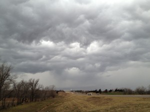
2016-02-26.Ag Blog.No 01.Storm clouds

Continue reading

Are We at Fall Yet?

So when does fall begin? From a farming, ranching, gardening standpoint, it’s when air temperatures drop into mild ranges and water demand tapers off. It’s when plants respond with their fall flush of growth. Animals respond by playing more. Livestock gain more. And the kids quit asking if we’re there yet!

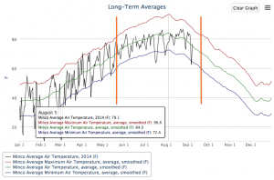
If we just consider minimum air temperature as a season mark, we could turn to a long-term averages graph for our dates. This graph from Minco, in central Oklahoma, has two orange lines that highlight the average dates when the minimum air temperature crosses 60 degrees F. We could use these to mark the beginning of summer and the beginning of fall.

2014 09 09.Minco Air Temp.Long-term graph

[Full site: mesonet.org / weather / past data & files / long-term averages - graphs]

Continue reading