Right in the middle of your conversation about how drought has cut hay production someone brings up climate. What pops into your mind? Do you have a picture of climate?
Drought is easy to picture. The empty ponds, low lakes, dried up crops are ready reminders of drought’s devastating impact. Weather is easy to picture. It’s what’s going on as soon as we step outside. Sun, wind, rain, heat, cold all give us an immediate picture in our mind. Pictures of climate? For most of us, it’s hard to picture climate. And if we can’t picture it, how can we get a grasp on the long-term cycles and patterns of climate? How can we know where in the cycle we are? How can we know what to expect?
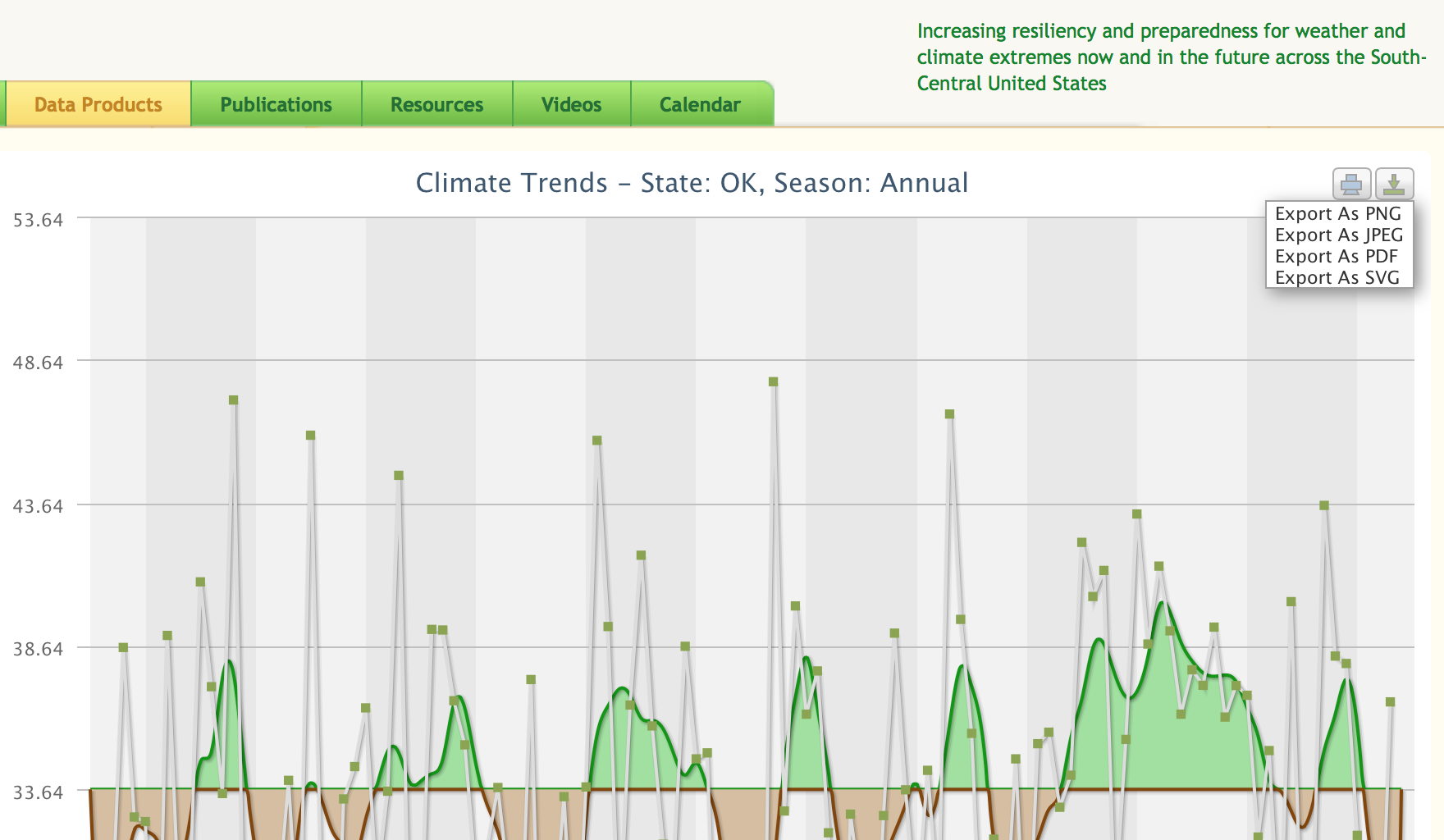
One way to picture climate is with a graph over time. There is a tool that can be used to create graphs of climate for any of the 48 continental USA states or any of the 344 climate divisions. These graphs use data from NOAA’s National Climate Data Center back to 1895.
The tool is the Historical Climate Trends Tool made available through the Southern Climate Impacts Planning Program at www.southernclimate.org.
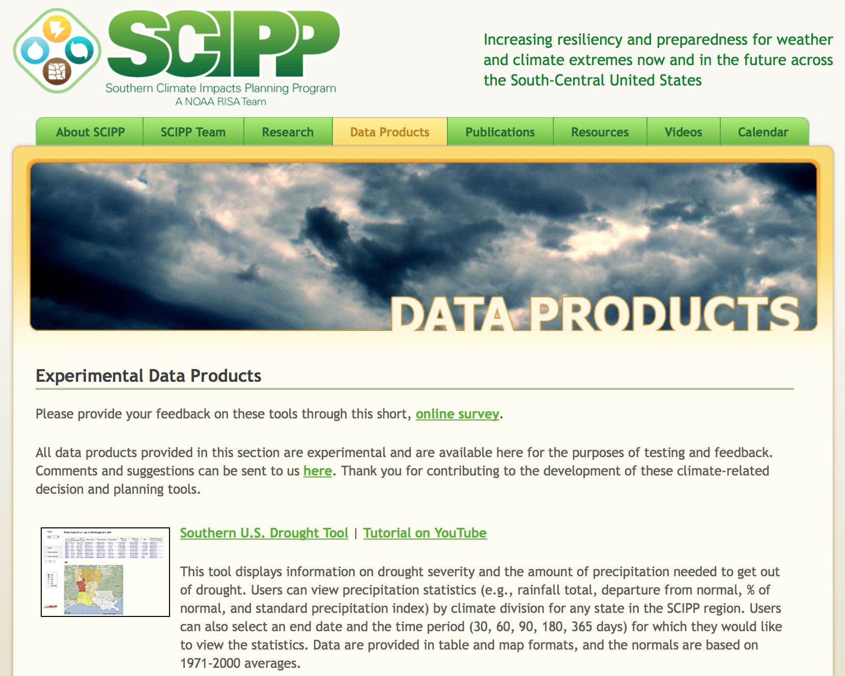
It is one of a number of tools in the “Data Products” section, so you’ll need to scroll down the page a bit.
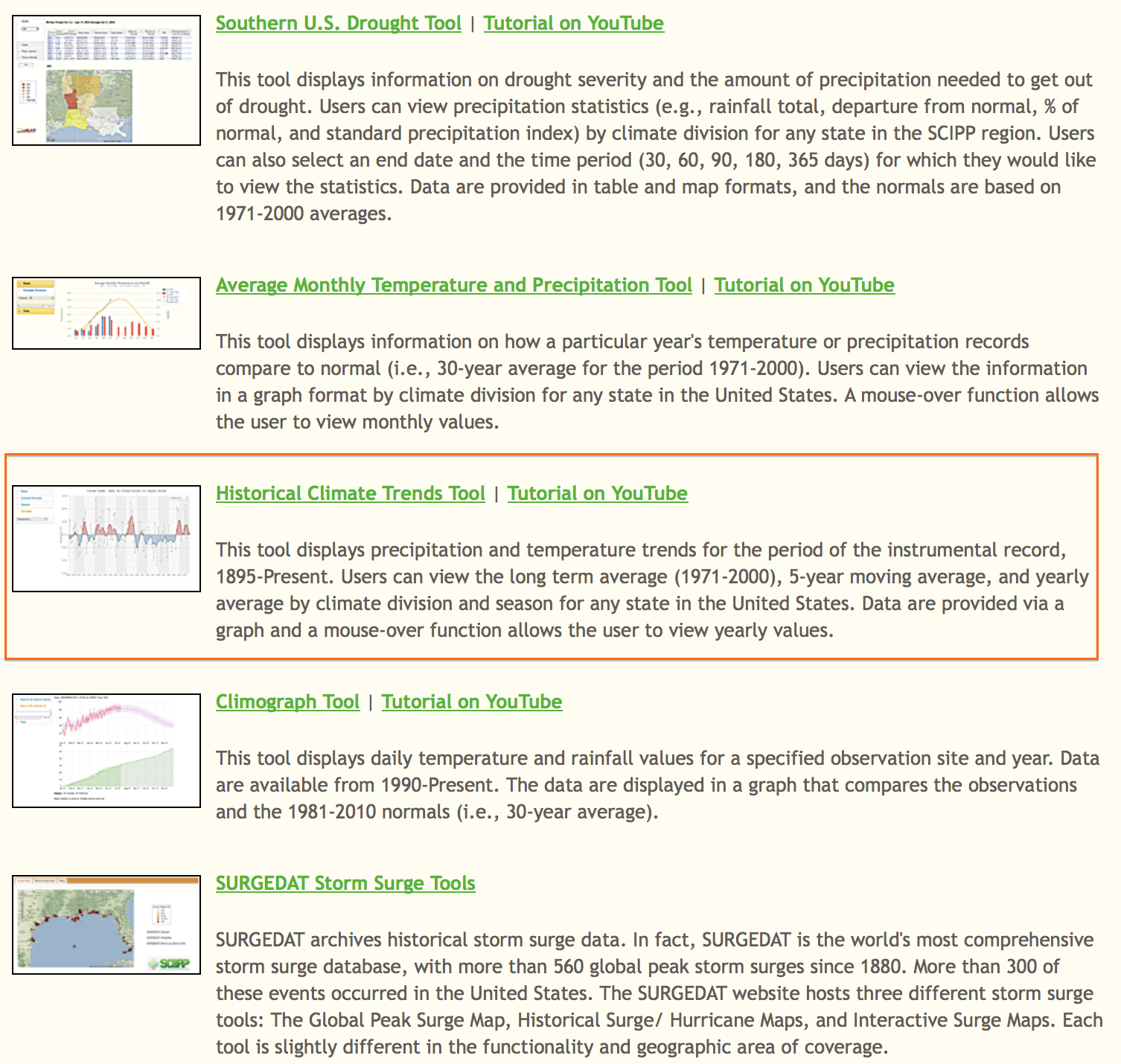
The Historical Climate Trends Tool uses a 5-year moving average to show above and below average trends compared to a long-term average. Air temperature and precipitation graphs are available for each state or climate division for the continental USA. Data from 1895 through the last full year can be graphed as annual, monthly, or seasonal values.
State and climate divisions must be selected from the menu lists. The map will zoom to the selected state an shade it in red. A selected climate division within that state will be highlighted with light green color. The “Entire State” or a climate division must be selected for a graph to be created. The “Season” default is “Annual.” The “Variable” default is “Temperature.”
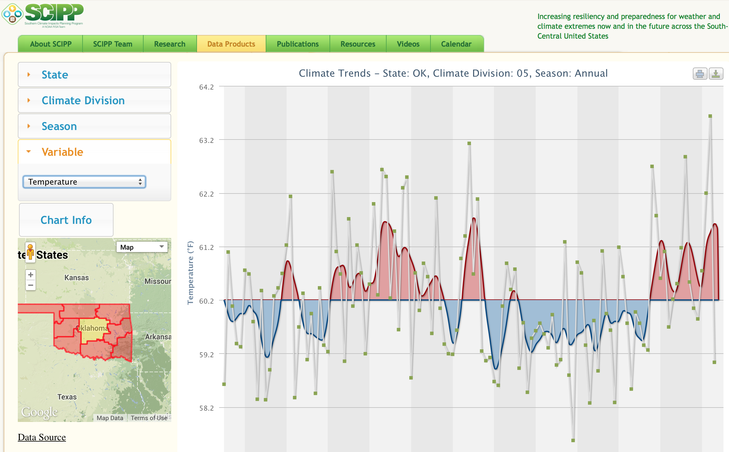
Graphs show a colorized moving average to show warm and cool periods for air temperature or wet and dry periods for precipitation. The average line is the long-term average from 1895 through the last full calendar year. For air temperature, a red area indicates a warmer period than the historical average, while a blue area is a period that is cooler than the historical average. On precipitation graphs, a green area indicates a period that is wetter than the historical average, while a brown area is drier than the historical average.
To view graph data values, roll over the graph with a mouse or on a tablet tap the data point of interest. The selected data point will be highlighted with a white border. The annual, seasonal, or monthly average in Fahrenheit will be shown when viewing air temperature. Precipitation values are accumulated inches of precipitation over the year, season or month.
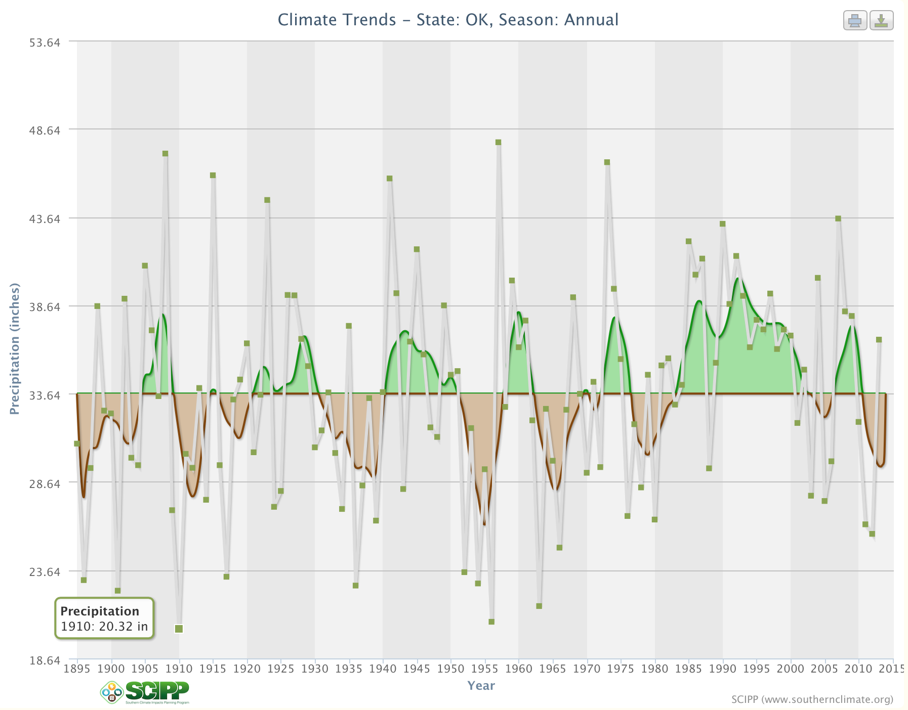
To save a graph for use in documents or presentations, open the export menu by selecting the download icon in the upper right hand corner. You can export the graph in several formats. PNG and JPEG work good for presentations or to add as images to documents. Graph title, data axes titles, and data axes labels are included on the exported graph.
Now you have access to a tool that lets you picture climate for any continental USA state or climate division. In Oklahoma, this Historical Climate Trend Tool has been used over and over again to show how our state cycles between wet and dry times. And these graphs are a great way to compare differences across a state or region to understand the climate differences farmers and ranchers face.
Happy Graphing!